When it comes to web trends, the discussion often tends to veer to design. Today, however, let’s look at some of the most prevalent trends with regard to content on higher education websites.
Focus on wellbeing
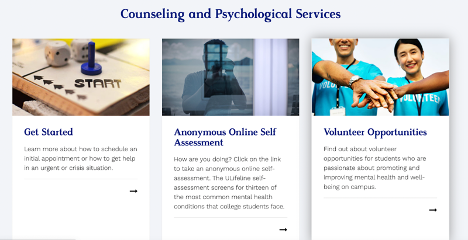
According to Salesforce’s 2022 Connected Student Report, concerns about the well being and mental health of students and staff continue to be a challenge for 76% of students and 73% of staff. It would serve colleges and universities well to highlight some of the initiatives to support physical and mental health, such as reduced class sizes, COVID testing, mental health counseling, workshops, and other resources. In fact, Emory University dedicates an entire website to the counseling services that are available to students.
Diversity and inclusion
Higher education understands the importance of diversity and inclusion, not just to foster a broader spectrum of thought, but to enable each individual to reach their full potential in a respectful and supportive environment. Prospective students should be encouraged to bring their authentic selves to the admissions process so both the student and college can determine the best fit. To do this, websites should contain more than a diversity statement, but instead make it crystal clear why and how they value D&I, and want it to be part of the organization’s DNA.
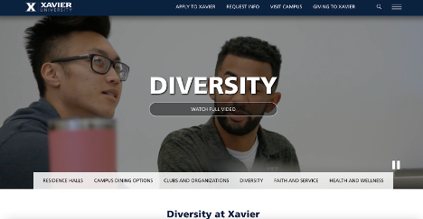
Xavier University links to its Diversity section right from the homepage. Right from the get go, the content is a reflection of the diversity in the University’s student, faculty, and staff body. You have multiple components, such as videos, images, calls to action, and pertinent statistics. The very comprehensive section discusses the wide spectrum of diversity and conveys to the student that each one of them is an asset to the university because diversity is the fabric of “who we are”. It also provides several ways in which students can actively participate in the D&I initiatives.
Flexibility
Since the outbreak of COVID-19 and the resulting online delivery of classes, students have become accustomed to an increased level of flexibility. Based on the aforementioned Salesforce report, twice as many students prefer hybrid classes to other learning approaches. The fact is, though, that it all comes down to flexibility. It makes sense for higher education websites to showcase their approach more than they do now.
Similarly, your faculty and staff are seeking a greater level of flexibility than before, so in order to recruit top talent, be sure to highlight what you can offer them in terms of work hours and locations.
Preparing for the “real world”
It’s no secret that higher education has come to understand that it needs to put a stronger focus on its value proposition. This applies to both traditional degree programs and continuing education. How do you convey to your prospective students that you prepare them for a successful career?
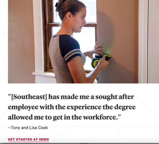
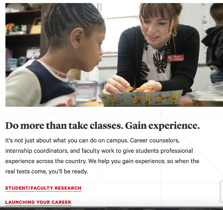
Some ideas here are showing how your college or university prepares students for interviews and helps coordinate internships (again, both virtual and in person, keeping flexibility in mind). Additionally, highlighting how you connect students to employers and alumni to foster a community, can make a massive difference.
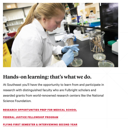
Below are just a few examples of the content featured on Southeast Missouri State University's homepage:
Program Finders front and center
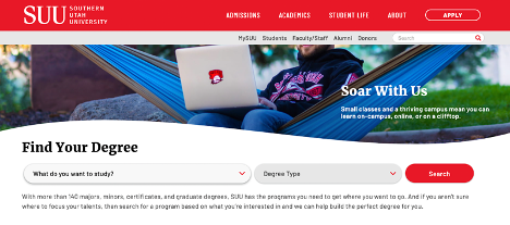
Similarly, showing a direct connection between a college education and career outcomes helps your prospective (and current students) better understand the value of pursuing a degree in a certain field. That’s why a considerable number of higher ed websites have moved their degree finder to the homepage, as seen here by Southern Utah University. Also note the blurb on the banner image that hints at the flexibility of learning on campus, online, “or on a clifftop”.
Pathways are another great way to entice your prospective students to explore the career outcomes for the degrees that you’re offering. Here’s an example from Milwaukee Area Technical College’s site:

Media Search/Expert Search
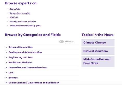
Higher education institutions have the ability to significantly increase exposure (and consequently, increase inbound traffic to their sites) while informing and educating their community. One of the easiest ways to accomplish this is by adding an expert search (sometimes referred to as media search) to sites.
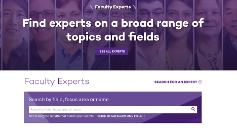
Northwestern University’s faculty experts section is a great example because it doesn't’t just have a search field, but also lists topic suggestions based on popular and current topics like Ukraine and COVID-19, as well as broader topics in the news such as climate change. Note that they even have a focus area on Misinformation and Fake News:
Personalization
While this is not a specific section or module on higher ed websites, it goes without saying that web content is not a one size fits all. Be intentional about what type of content you show to which individuals based on criteria such as form submissions, visitor attributes, location, and visitor behavior. Finally, don’t start with your content and then decide who should see it. Start with your audience and develop your personas, then determine which content they’re looking for (and then they’re looking for it based on their decision making process)
What are some other common content elements or trends that you’ve been seeing on higher ed websites lately?
Last Updated: Jul 14, 2022 11:00 AM