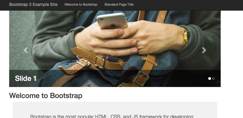
Responsive Web Design (RWD) is an approach that strives to provide an ideal viewing experience for a wide variety of devices. A site designed with RWD principles attempts to respond to each device accessing the content, and adapts the layout to fit the user's display.
Like many frameworks, Bootstrap offers a fluid (or fixed) grid system that scales as the device size changes. Bootstrap's grid system is based on 12 columns and includes predefined classes for easy layout options.
The question is, how do you structure your Cascade CMS implementation to easily allow content contributors to create and edit responsive content that uses the framework's expected XHTML markup? And the answer lies within the power of the Data Definition and Format.
